
Branding + Marketing Materials
The Challenge
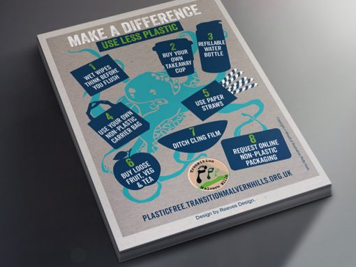
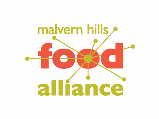
Malvern Hills Food Alliance encourages the growing, production, sharing, cooking and eating of food that is grown, raised or made within a 25-30 mile radius of the Worcestershire Beacon. Its aims are to make local food readily accessible and available, make most residents fully aware of the benefits of consuming local food and make local food affordable to all.
The group was founded in 2012 and needed a logo to give it a strong visual identity as well as a series of leaflets and posters that promoted what it did. The design of each of these needed to stress the organisation’s local nature and have a strongly inclusive feel to highlight that local food is affordable and accessible to all.
The Solution
In the first instance, the committee felt that the logo should emphasise food production and farming. As this idea was explored it soon became clear that this did not give a logo that was as strong or as inclusive as it needed to be. The answer to the dilemma was to focus on the local nature of the organisation.
The resulting logo is largely typographical which means it is easy to use in a multitude of settings. At its heart is a stylised interpretation of points radiating out from a centre of a map. As well as creating the feel of a map it also gives the logo vibrancy and dynamism which reflects the organisation’s aims. This vibrancy extends to the leaflets and posters that were created.
Related Case Studies