Rhubarb, Rhubarb…
The Challenge
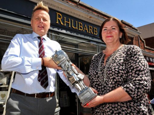
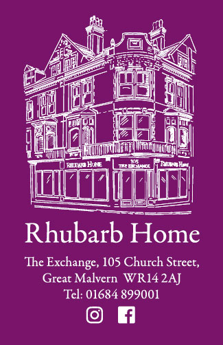
Rhubarb has two shops in the centre of Great Malvern in Worcestershire. The original shop, Rhubarb, offers beautiful home accessories, clothing, jewellery and gifts. A second shop, Rhubarb Home, which is in one of the town’s most iconic buildings, The Exchange, offers home furnishings. All the pieces in both the shops are carefully sourced and meticulously curated by the owners, Nigel and Sara.
Both shop fronts feature their names in a striking gold colour and distinctive font, which helps them stand out from other shops on their street. But Nigel and Sara wanted to create a strong brand identity they could feature on Rhubarb’s bags and other marketing literature.
The Solution
The key to creating a powerful brand identity was the iconic site of Rhubarb Home – The Exchange. We created a simple but strong line drawing of the building. We used a bold purple colour that reflects the shops’ name and placed it on a simple white background, which creates a clean and original look that is in keeping with the pieces Nigel and Sarah choose to stock.
The line drawing is used on Rhubarb’s bags, as well as all its other marketing literature.
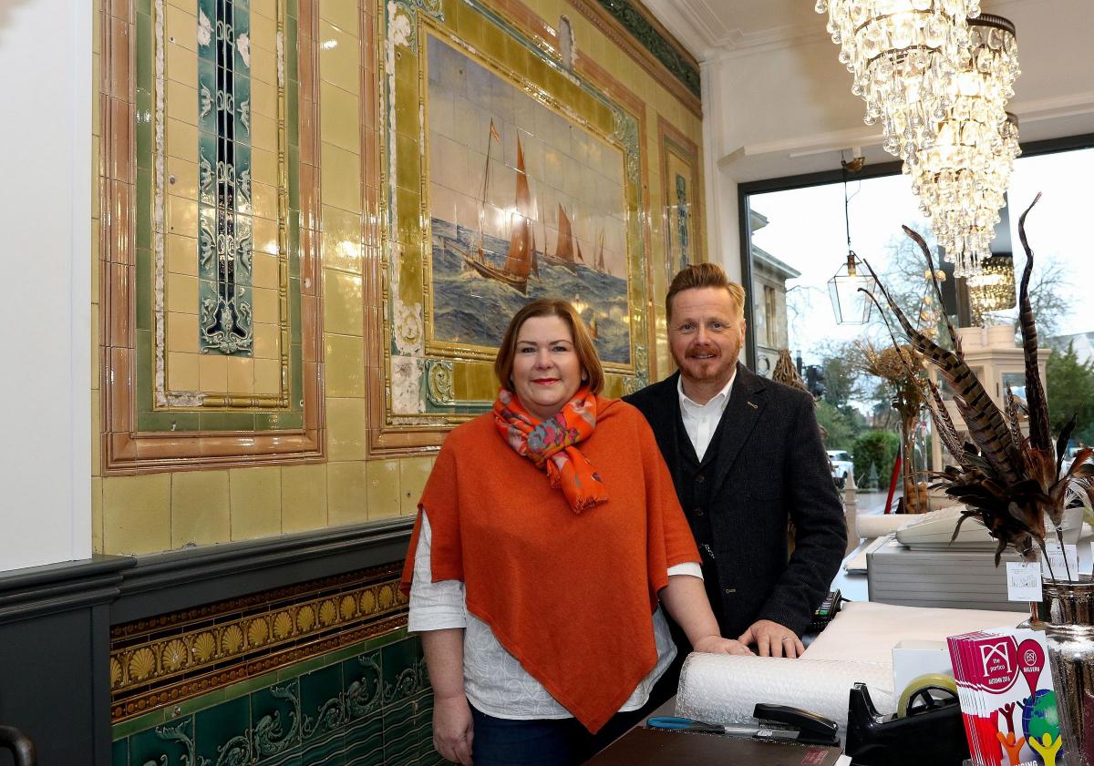
Take a look inside Rhubarb.
RELATED PROJECTS